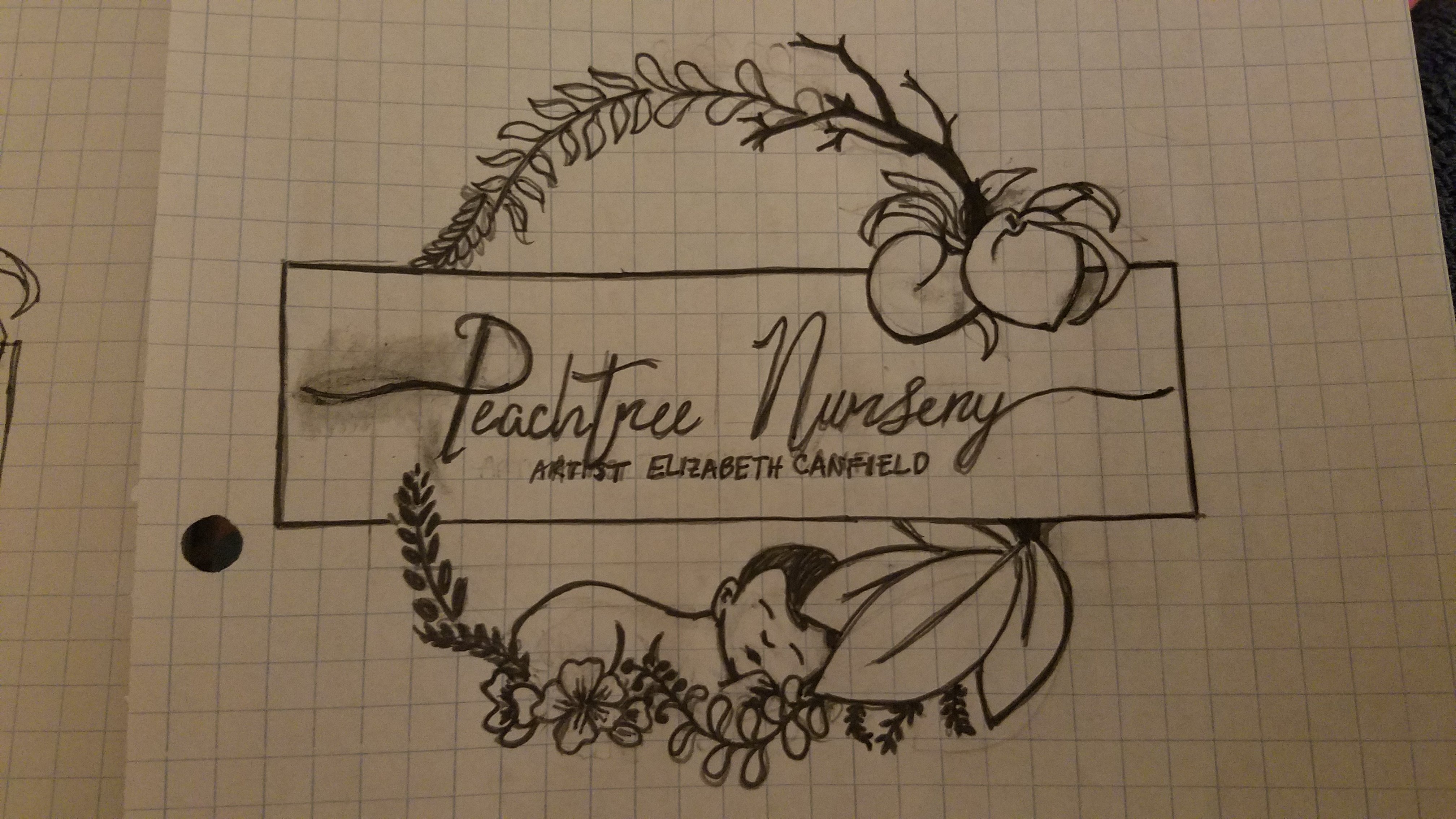
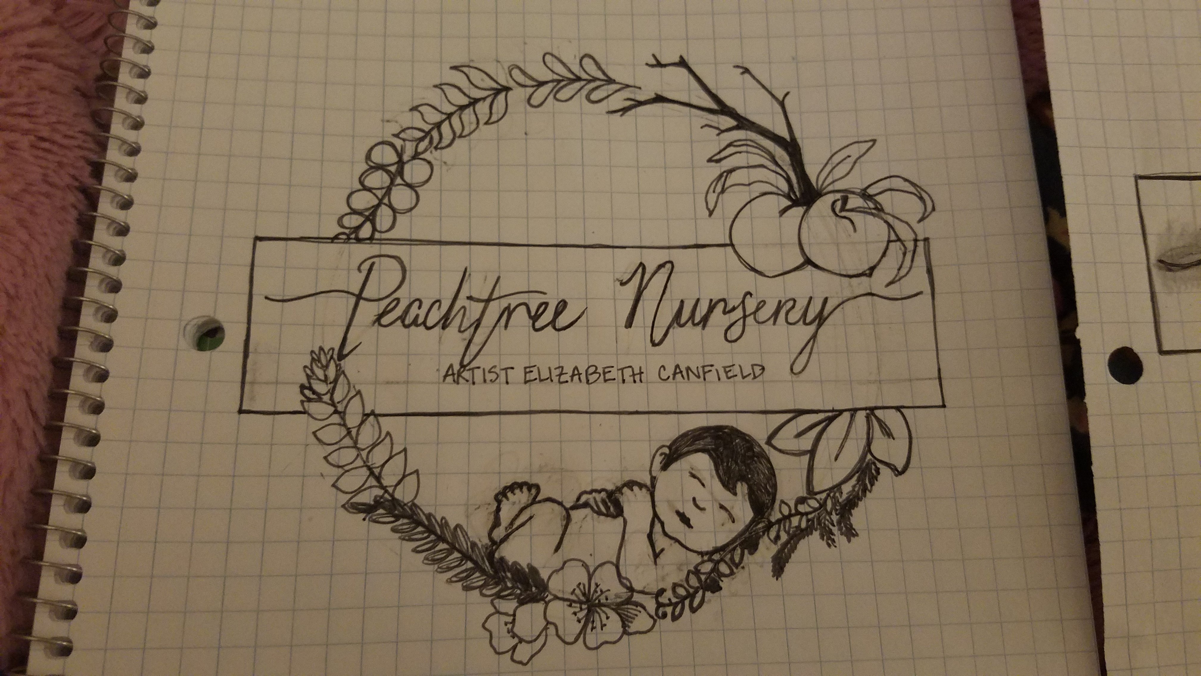
Here are two logos that I have sketched out for my nursery. I can’t decide which one I want to pursue. Any thoughts?
19 Likes
They are both beautiful but the first one has my vote. 
I like the first one 
I love the second one! You are so talented!
2 Likes
The first one has a more pleasing ‘feeling’ about it to me. I hope that makes sense. It just seems “right” somehow.
I would have to pick the first. Just one thing I would tweek (If you don’t mind) would be the leaf going over his head, I would put it over his tushie instead. Just my opinion. They are both very cute!!
2 Likes
I like the first one the best but they are both cute.
I Love your logo style, gorgeous! I like the first one better, but if I am honest, I didn’t notice the baby as quickly as I did in the second logo, it caught my eye right away.
1 Like
I like the first logo, but I like the baby in the second one
1 Like
Excellent work!!! You’re really talented!! Personally, my favorite is the second one 
1 Like
I like the first one.
Amazing job !! I like the second one
1 Like
I like the first one. The slight bend of the back seems to fit in with the circle better.
I like the first one, great job!
My favorite is the first one.
I like the shading in the first one, but the baby In the second one.
I like the first one.
I like the first one better but the baby in the second one stands out more.
First one.
Second one, but I would use peach tree leaves on all branches and add leaves on the ‘main dry branch’.