New concept…
2 Likes
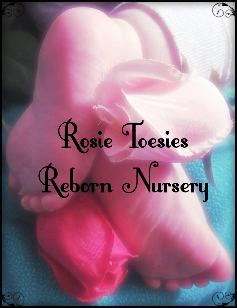
Love it! I think the only thing I have to say is I would make the background image clearer and less over exposed? I think it’s very cute and I love how simple it is the composition is compared to before!
1 Like
I think I’m gonna go with this! I’m finally happy with how it looks. Thank you everybody who helped me!
1 Like
Thank you!
This one is nice and it shows the toes way better, as the subject of the name. And I like how soft it looks.
1 Like
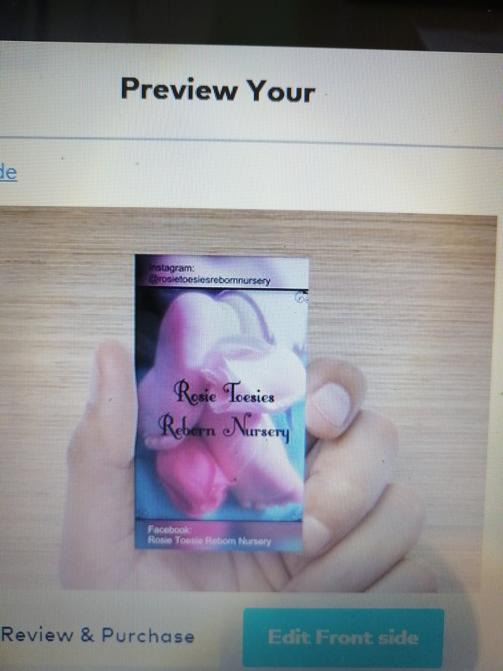
I love the logo and the business cards. Way to go!
1 Like
Thank you!
And yes!!! 
Definitely better!
I like this one but I think it might look better if the darker pink rose was on top and the light pink rose was on the bottom. (reverse them). The light coming in to the picture washes out the light pink rose and it blends into the foot. I think the light rose would look better against the blue blanket. Try it, maybe??? @morgan123
1 Like