What about fewer roses and pink roses with toes. The lighter color would show better and use blue lettering. Covers boy and girl colors and would show up better.I like the italic heavier letters and I think your idea is good, I would just do lighter pastel colors myself. JMO Do what makes you happy! 

1 Like
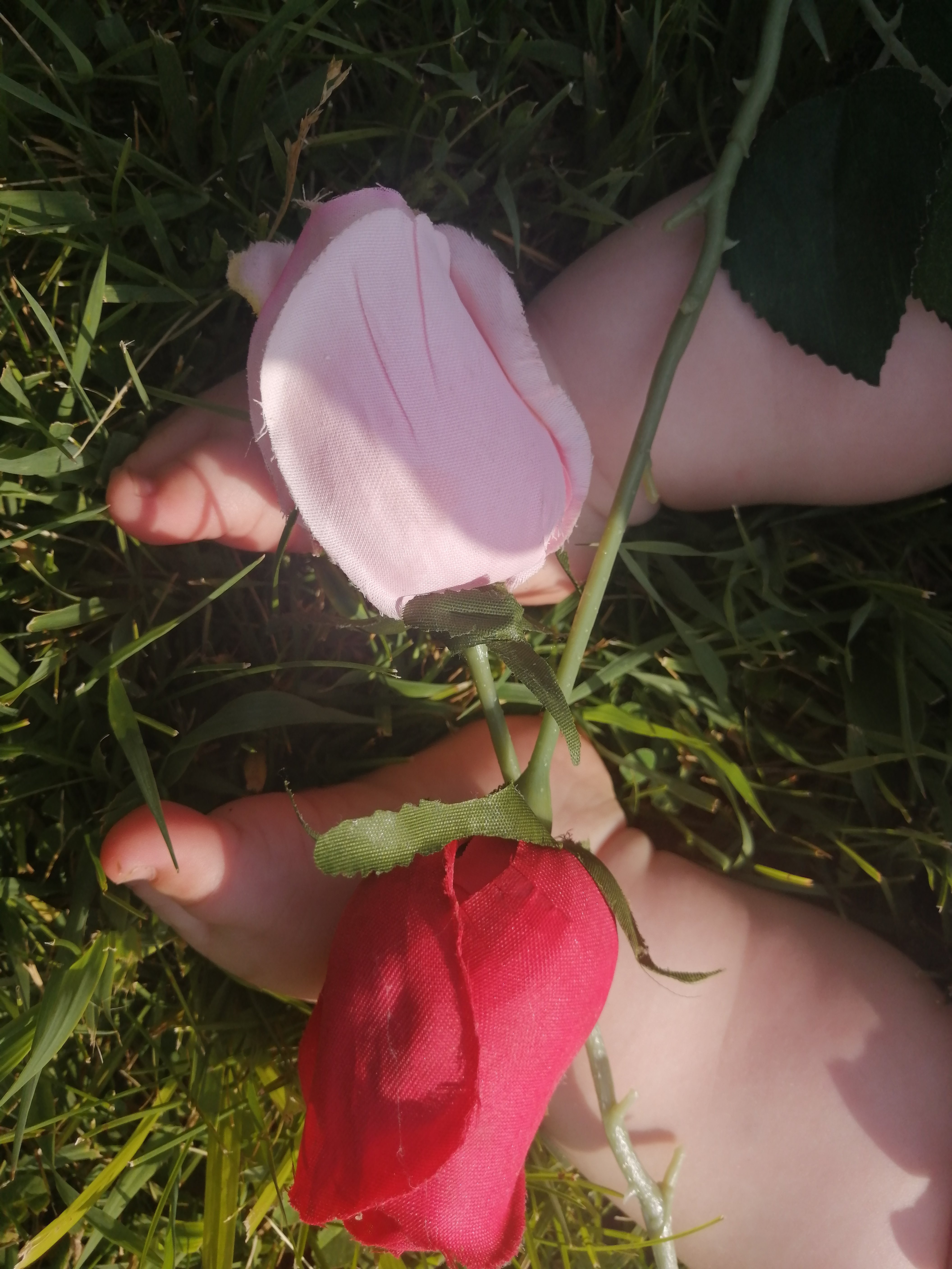
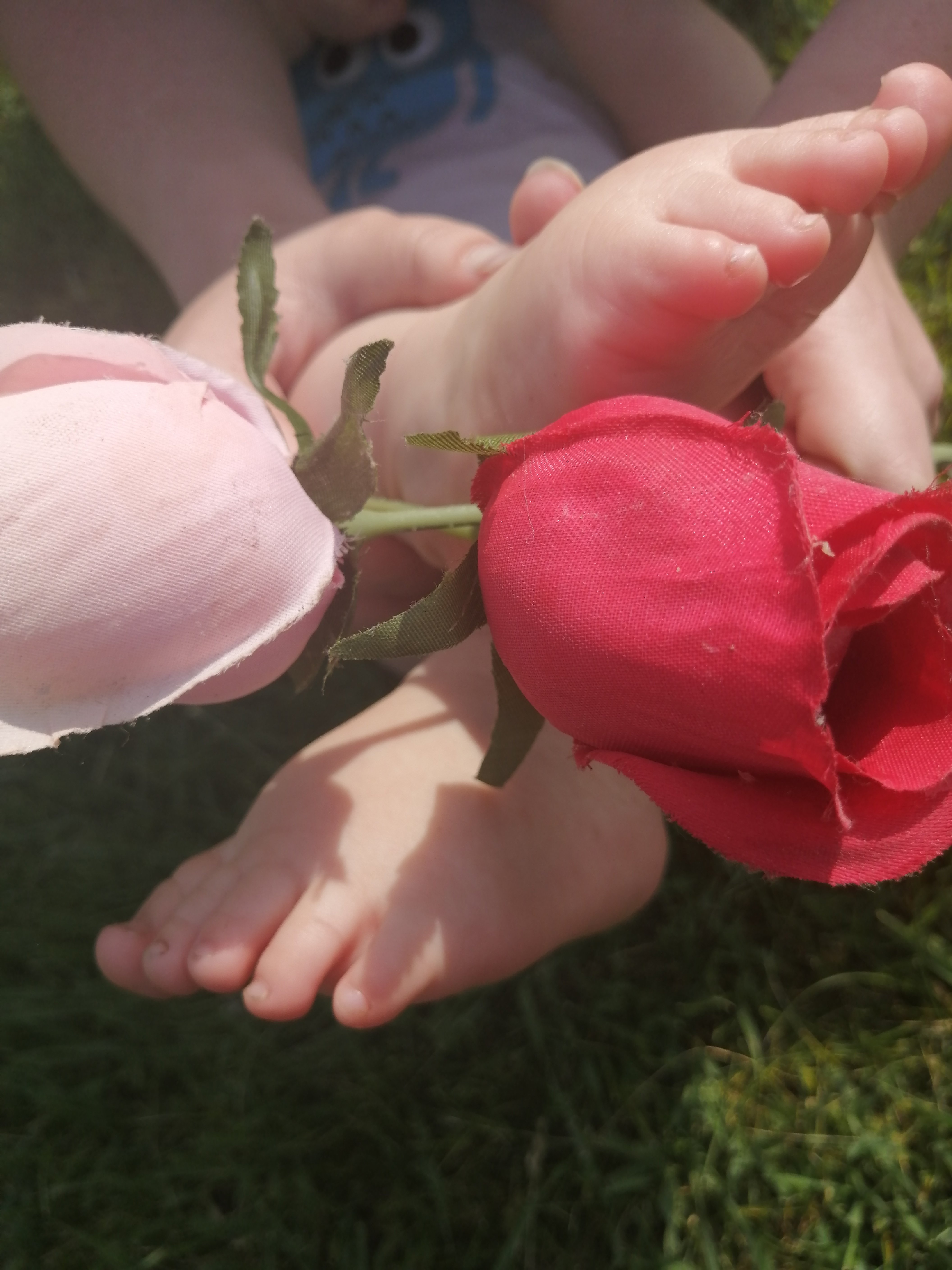
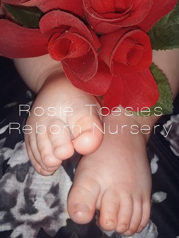
If you could crop the hand out on the bottom picture and some of the grass on the bottom I think it would work with an italic printing in a dark color. I like the lighting on this one much sharper and lighter, the feet show up much better and clearer. JMO
1 Like
I like the other one better after you used the filter.
1 Like
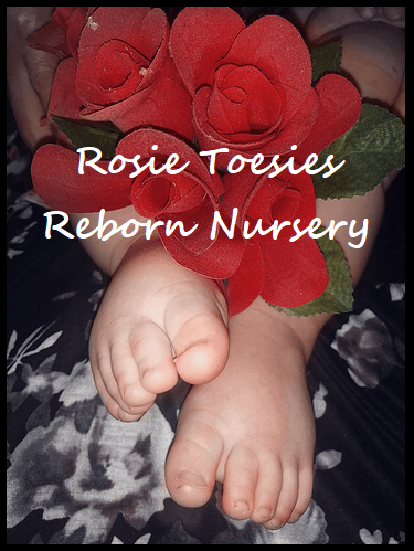
If you use the busier first one so white font on the roses. It will stand right out 
Good idea, Bold white letters!
1 Like
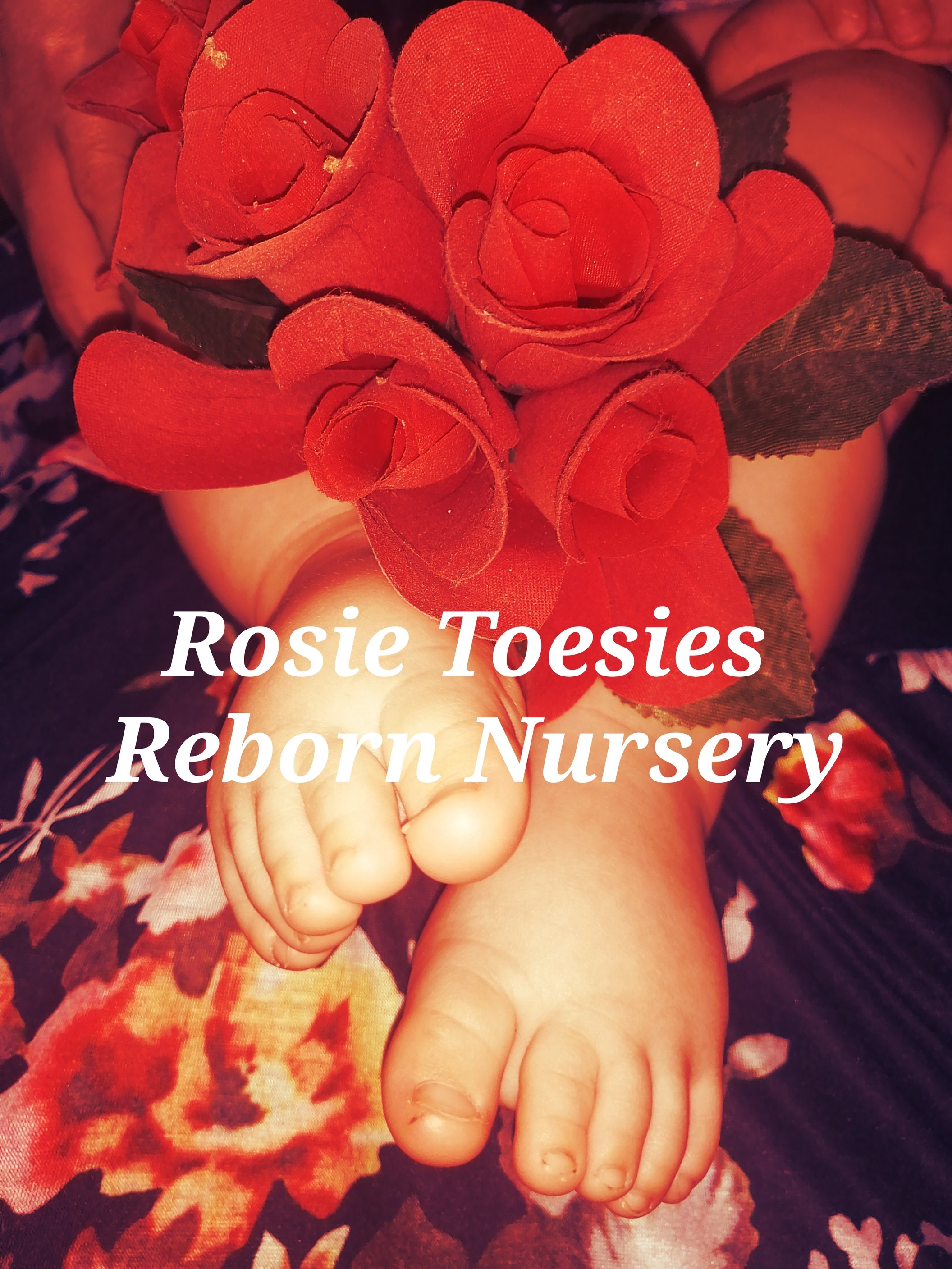
Yes!! But move the letters up on the roses and use a more feminine font
Move the white letters onto the red roses. You need the contrast of color. JMO. That would make a lovely business card, you could put all your information on the back.
I think the lettering needs to be more solid and bold. Jmo
1 Like
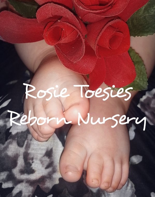
I think something like this
6 Likes
That’s my favorite.
1 Like
That looks great!
2 Likes
Looooooove it. However. I personally would just use his toesies and the top row roses  above his feet. Less busy. Then put the nursery name across his feet. At days end it’s all you


Cool. From a design point of you you want to use white lettering put a black outline around it not too thick just think enough to be seen and read. Because the highlights in the picture where the flash hits the feet washes out the letters that are above that. If that makes sense? Just something I actually paid attention to while at school LOL
So to me, the first pic font on the third image outlined in black is perfect visually and aesthetically
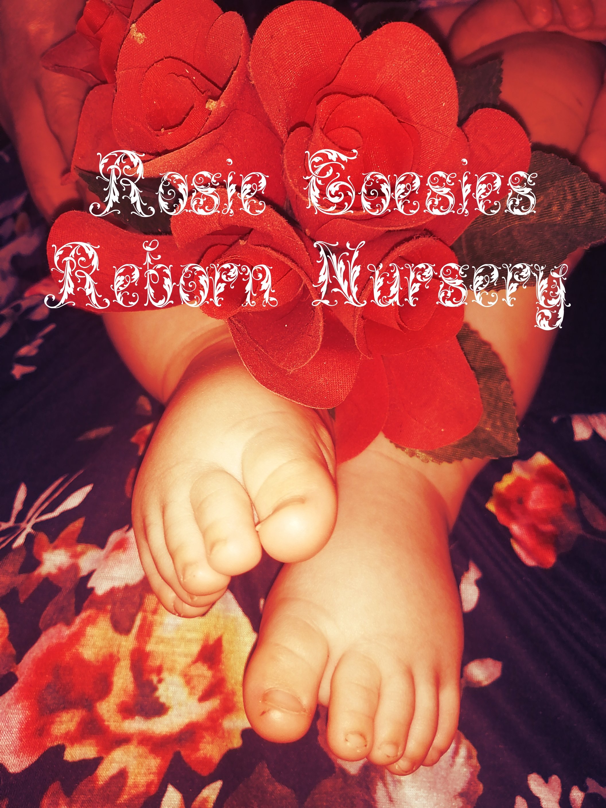
third picture is my favorite.
My app doesn’t let me do outlines on letters.
Last one looks great.You could try with different colors on the writing and see which stands out the most.