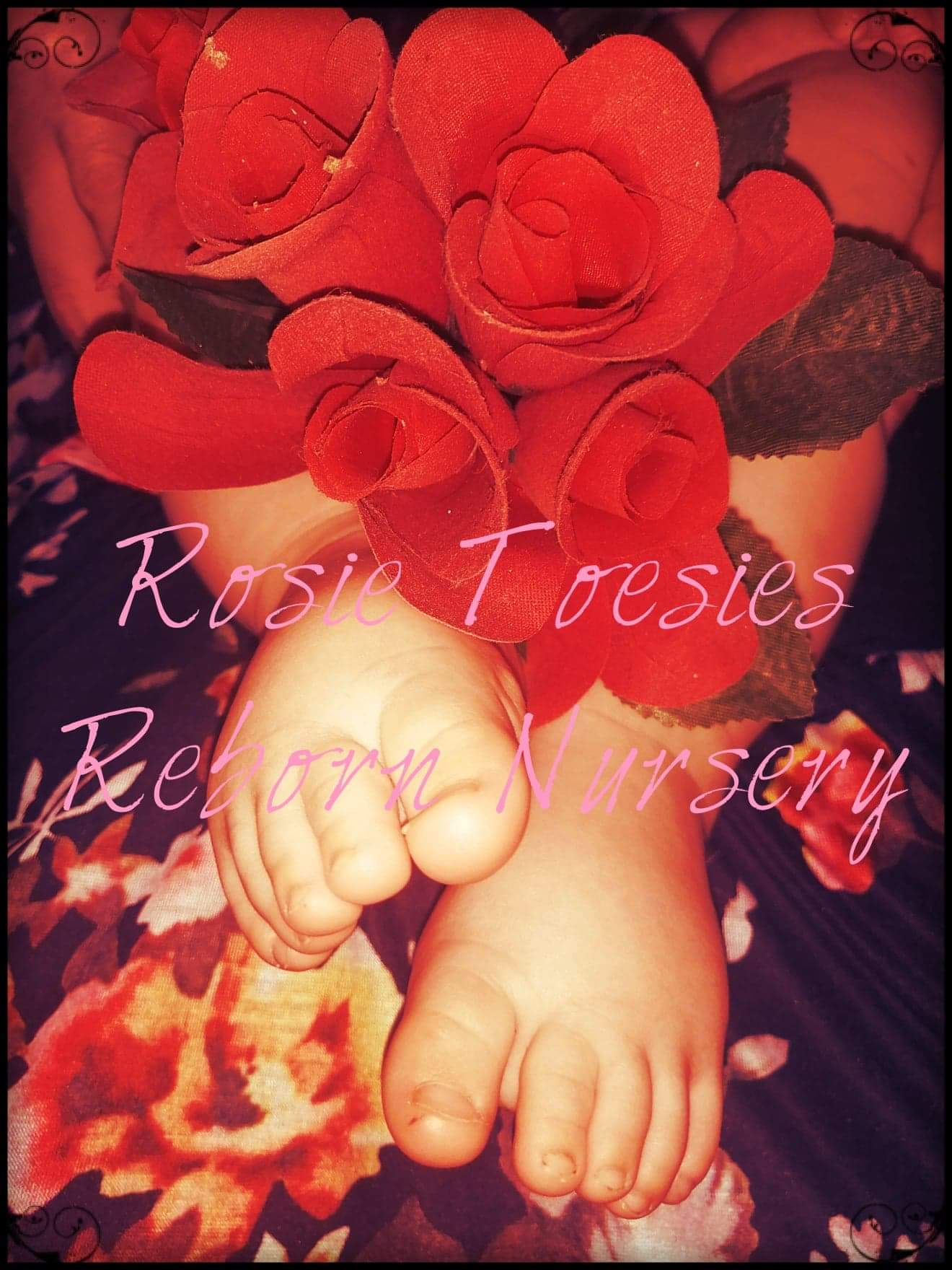
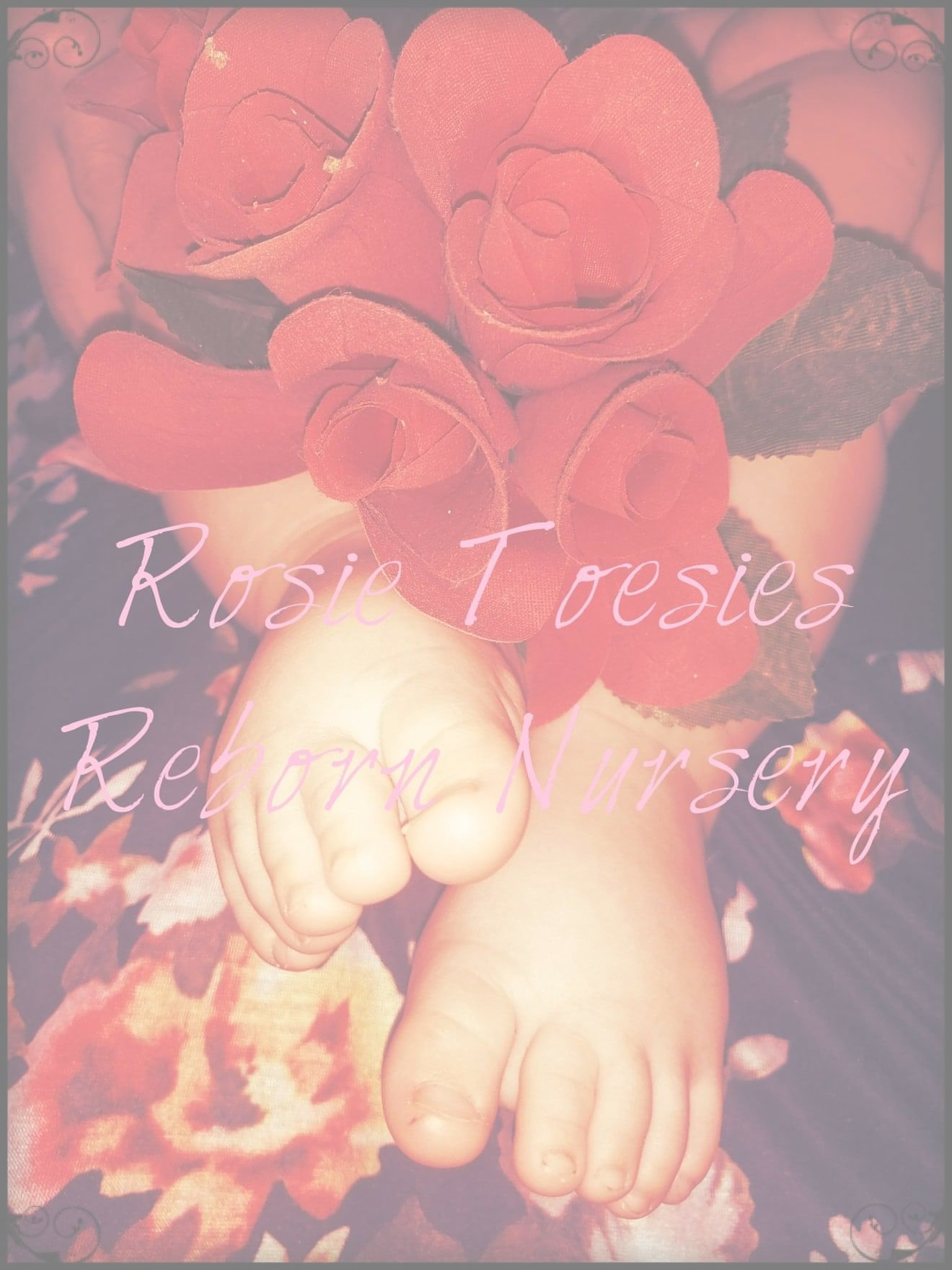
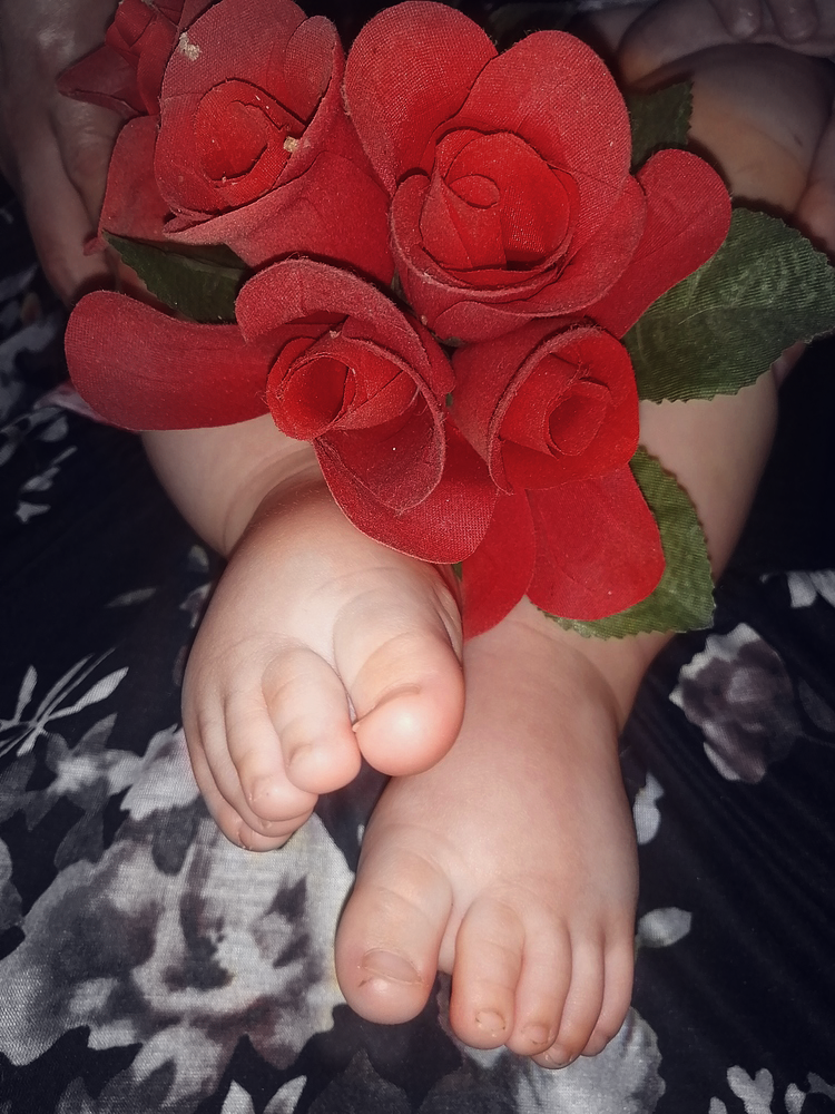
So, it took me and my sister all day but we worked out this logo! What do you guys think? The picture is my nephew’s feet.
9 Likes
Cute, and a great idea!
Nope
To dark
To busy
Can’t read the text
You can’t use it as a watermark
You need something simple
White background
Easy to read
Sorry
Look at other logos for everything around you
The goal is to be identified, recognized and found easily
10 Likes
Cute idea. To make it a logo, how about some simple pink baby footprints with your nursery name. Maybe a few rose petals.
4 Likes
The first thing I noticed was the dirty toenails 
3 Likes
I like it a lot but the text is hard to read. Maybe a different color would make it stand out more? Or try white roses.
1 Like
Have to really strain to see the words.
2 Likes
Nooo thats my logo
I have two cards one with blue feet and one with pink feet. Please just do toes not like mine. Thanks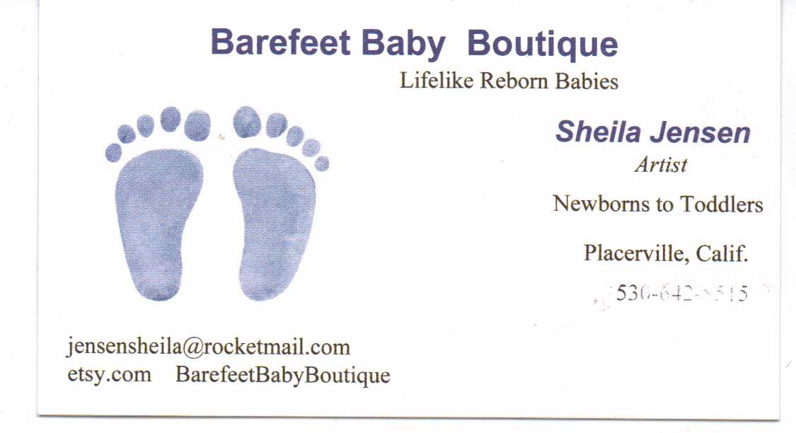


I’d go with something simpler and easier to identify even without reading any words-- most great logos I’ve seen are mostly line art with distinctive colors. That way, you can overlay them as watermarks too. PNG images, which can have transparent backgrounds, are ideal for this.
I’m not a graphic designer or anything, but maybe something closer to this?
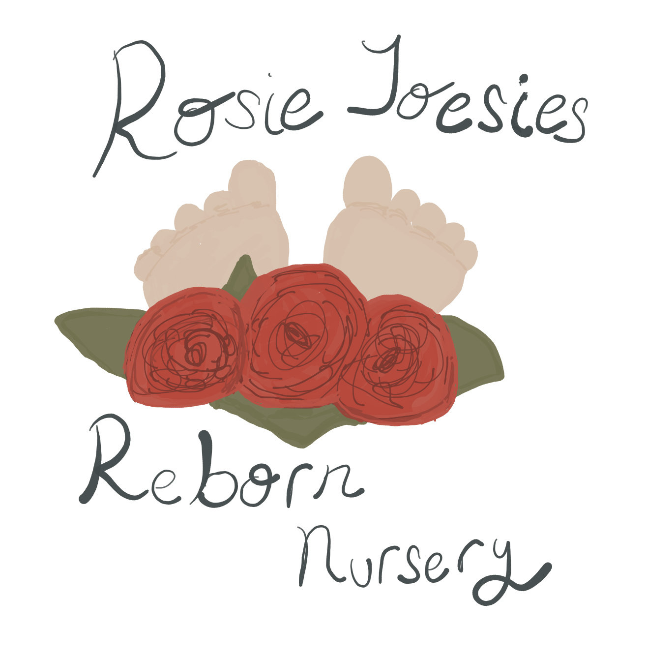
(edit: I tried to upload it as a png, but the forum only takes jpegs. You get the idea, though!)
5 Likes
I think yall are being kinda hard on her.
Dirty feet? Really? I did not even notice that til it was said.
Ok, on to my honest critique. While it may be a little busy by some folks’ standards, I can see that it is a reflection of what you love. That is important and you should have a logo that is meaningful to you. Overall, simplier is better but the main negative thing I would say about this one is that the writing gets lost in the background.
7 Likes
I really like it. I means it’s babies feet I didn’t pay any attention to the toe nails. I would just say change up the font or change the color of it to make it stand out more. You want that to be the first thing that catches people’s attention. Other than that I think the background goes perfect with the name
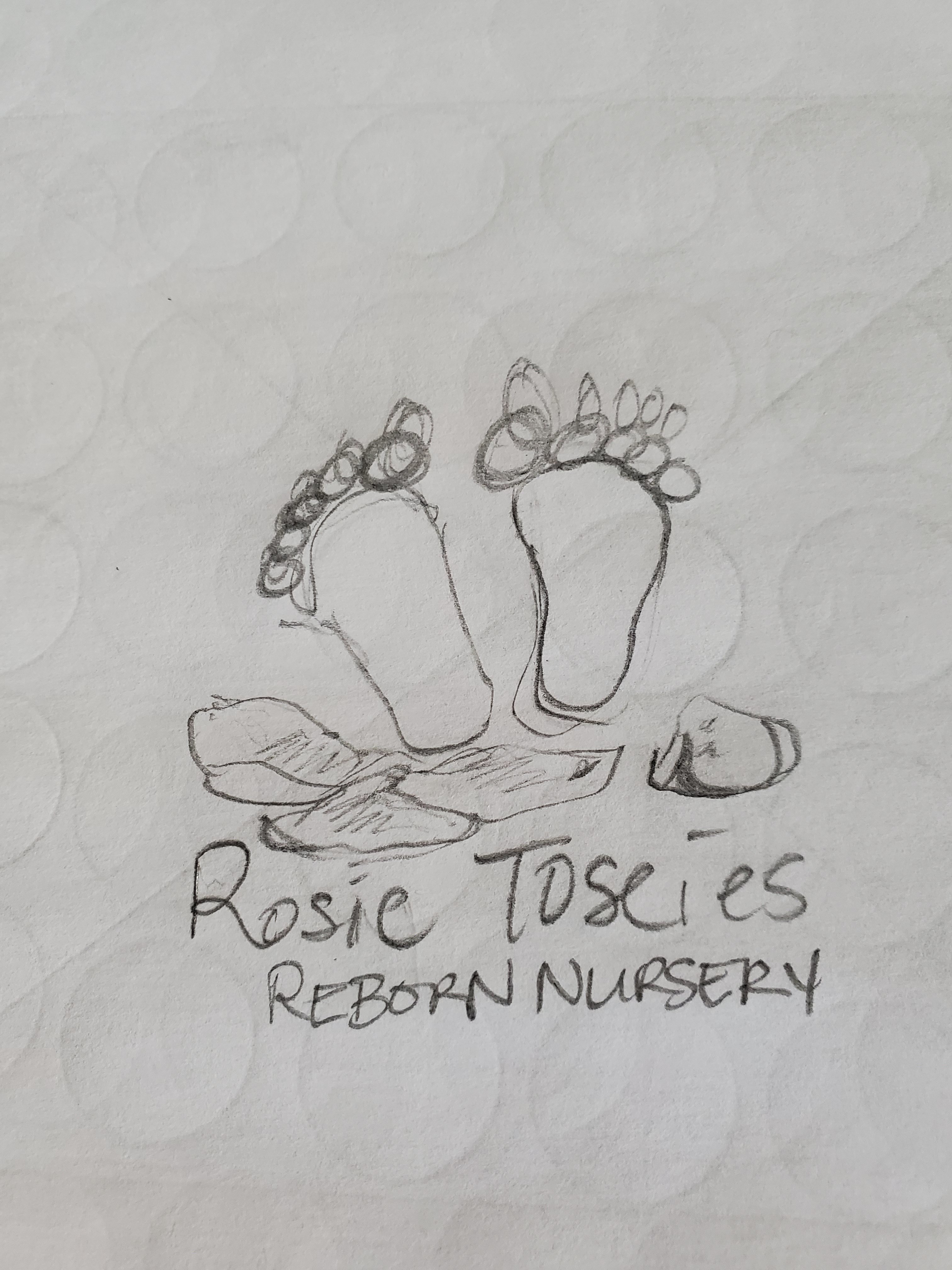
I would need the original file layers to do what I have in mind… Basically if you could remove the text, lighten the overall image and then put text back on top of it in a big thicker font with black or white writing that would stand out more. Here is a lightened version of your image to see what I mean but I could not remove the text layer to put a darker one back on top. If you can send me the file without the logo on it I can fix it for you.
4 Likes
Does the water mark and logo have to be the same? I had this idea…
For watermark, something simple like…
And then changing to words, like…
Would that work? I’m new to this and have like zero clue what I’m doing lol
2 Likes
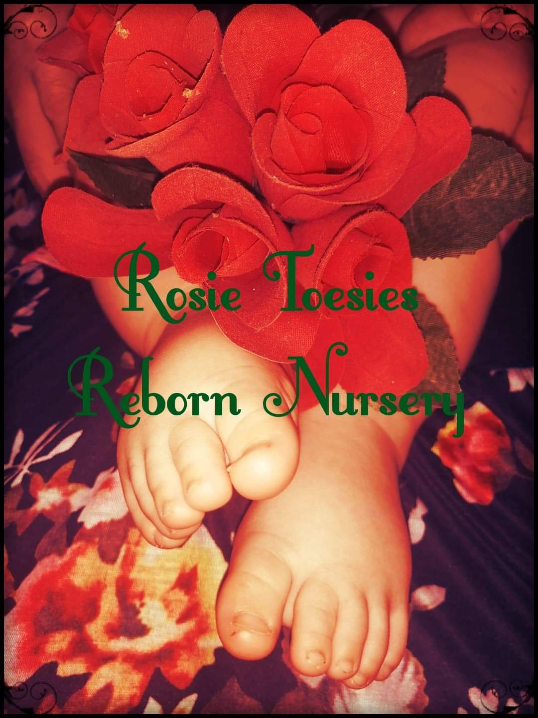
The green text is definitely easier to see! Did you put a filter on the original photo, though? I think the reason people initially thought it was too dark is because the color balance leans red. One thing that might be interesting would be a selective color effect… where you select a specific color range to keep, then desaturate the rest. That way, you could maintain the “rosy” color scheme without it looking overwhelming!
I’m not sure if my idea would look good, but it’s worth a try 
2 Likes
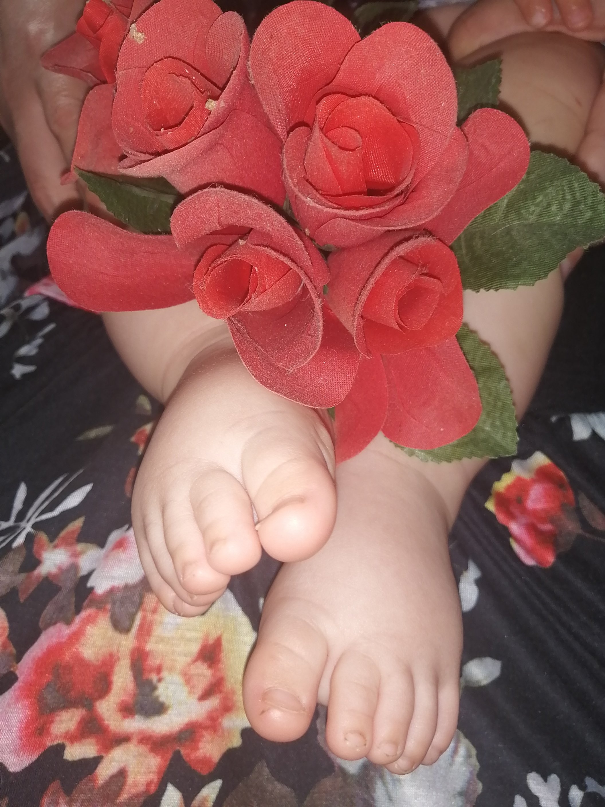
Ok, cool! Here’s what I mean by selective color:
It brings out the color of the roses (and the toes!), but ultimately the focus can be on your nursery name. It’ll give you a little more flexibility with font and text color.
You could play with the range of color as well to suit your style. Hope this is helpful 
4 Likes
That does look good! I’m going back to this with fresh eyes tommorow. Do you thing the water mark idea I had is okay?
1 Like
Yeah, the watermark looks lovely! I think the primary reason for using one is to prevent people from stealing your pictures, so as long as you have your nursery name on it, it should be totally fine.
2 Likes
Thank you so much!
3 Likes
Even if you don’t choose to use this as a logo, it may be really nice as an advertising piece for social media etc. definitely useful don’t pitch it!
2 Likes