I have to choose one of those 3 logos, and I am not sure wich one I like the most. I can ask for revision but sincerely they are all stunning!
1 Like
They ARE all beautiful!!!
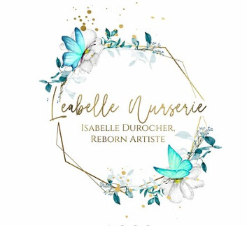
But…I like the first one the best ![]()
2 Likes
That’s the one I am inclined too, my husband prefer the 2nd, so I am not sure!
This guy has an incredible talent, it’s the second time I use his service.
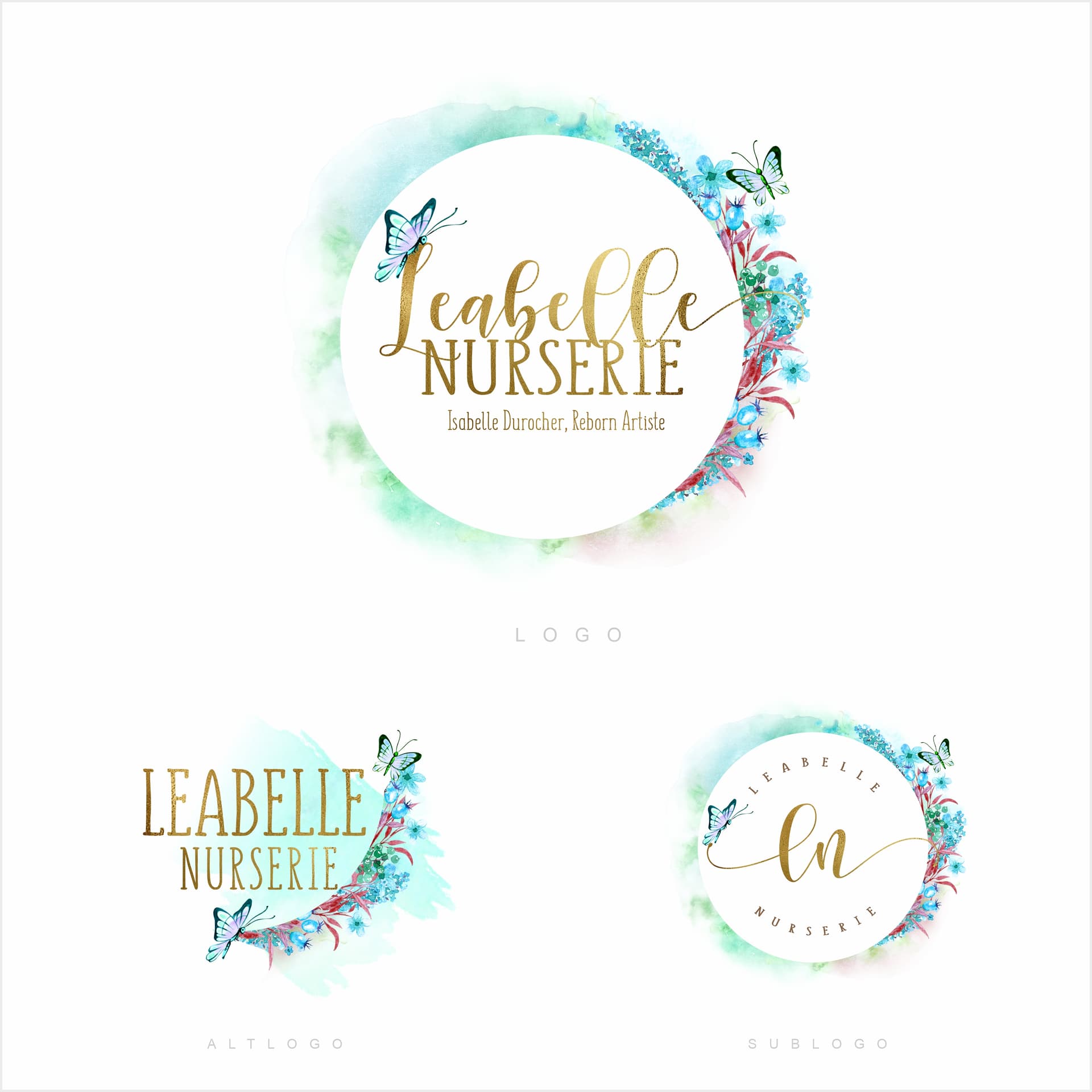
I like the middle one. The watercolors on the sides remind me of painting, which ties into the reborn artist. Plus, the colors are so pretty!
They’re all lovely, though. Very talented artist!
1 Like
I like the butterflies…it seems more “nursery” to me.
1 Like
my choice
5 Likes
They all have butterflies!
I prefer the first but they are all very nice!
2 Likes
I like the first one for its softness. More baby to me and I like the free form.
2 Likes
I LOVE the first one ![]()
1 Like
That’s my favorite, too!
1 Like
So there are two at the bottom that would work really well together and I’ve learned that we’re supposed to have a couple versions of our logos. It’s the elaborate one up from the bottom row and then the one diagonal to that one on the bottom right hand side.
First ones ![]()
1 Like
All gorgeous. I love the second one best ![]()
1 Like
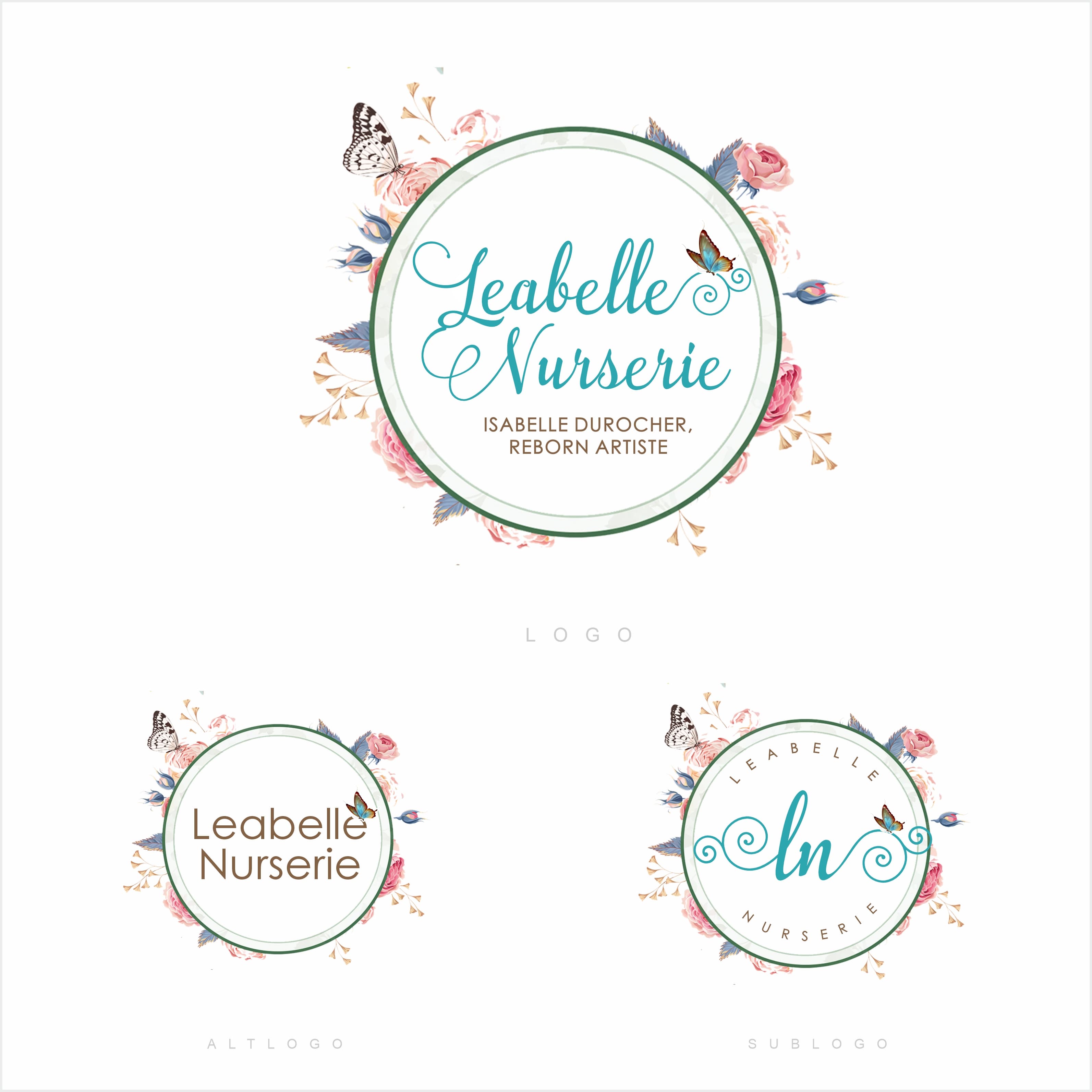
I like the very top one best. Nice colors and the words stand out.
4 Likes
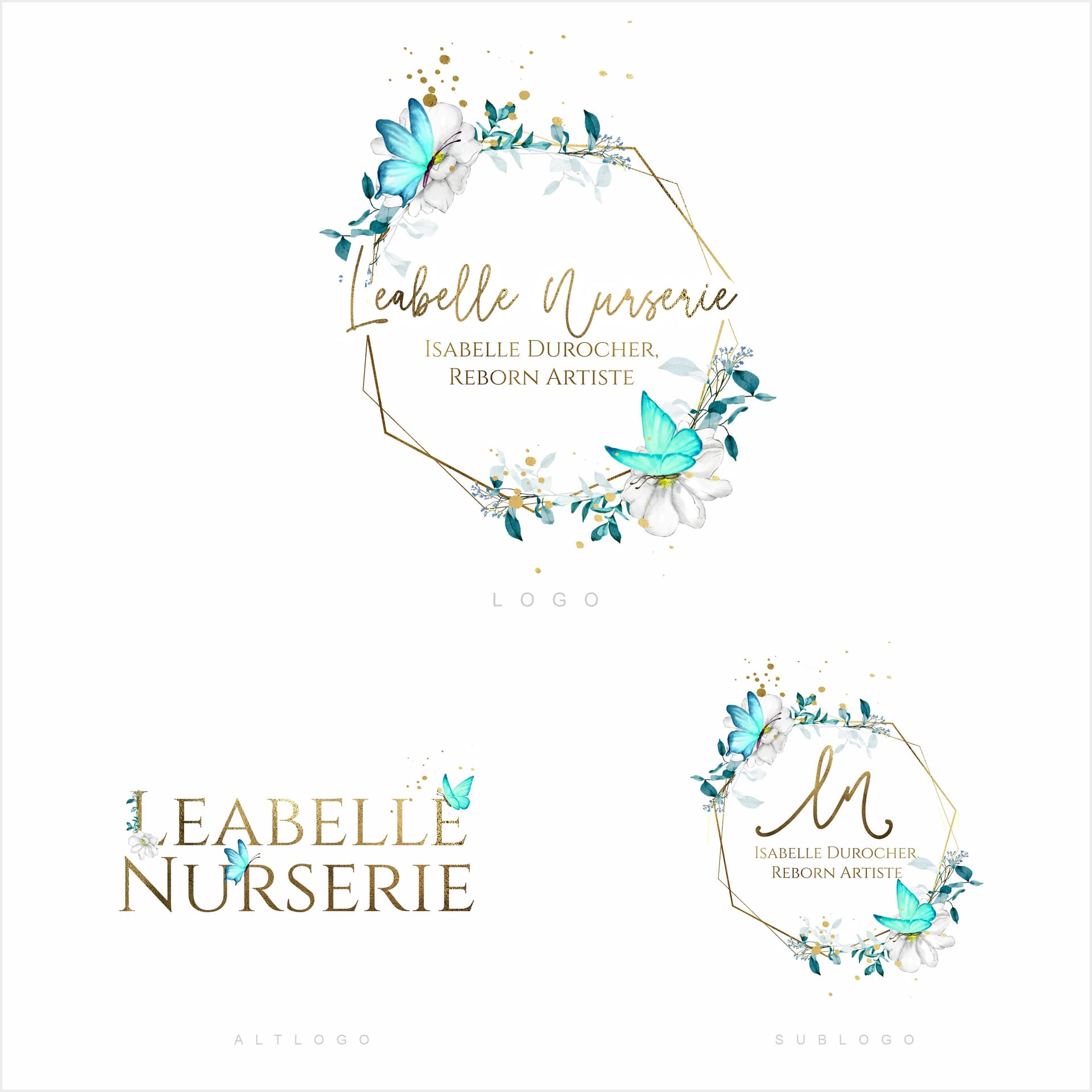
I have ordered a principal logo, a alternative logo and a sublogo, that’s why there’s 3 on the same picture. I will use them if I need a watermark for exemple or on a sticker, so yhe 3 of them need to be similar to each other.
I have asked for the first one with different initials, I will see what he proposes!
4 Likes
Who did you hire to make the logos? I need to find someone who can make one for my nursery.
https://www.etsy.com/ca-fr/shop/LogoDesignandMore
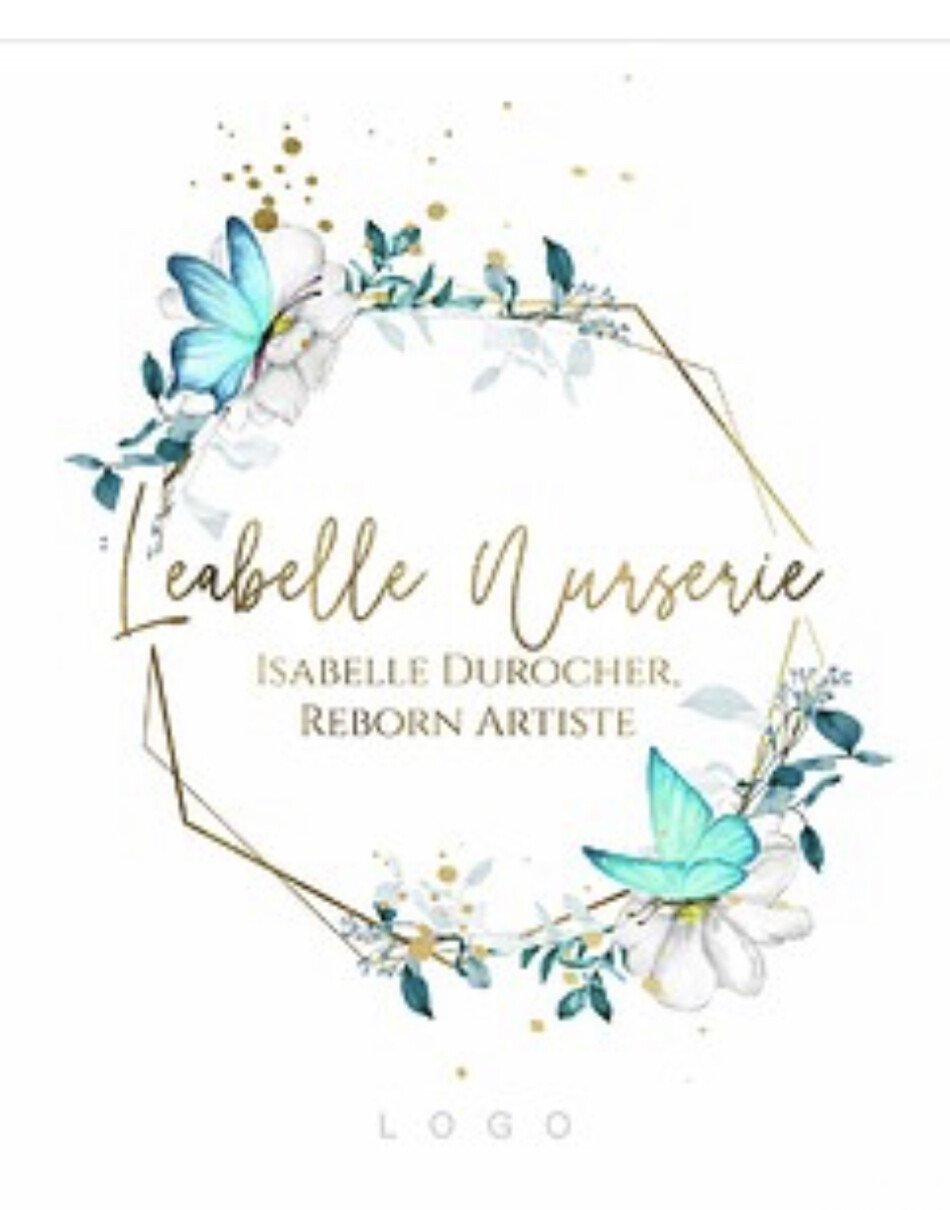
Here’s the one he has made for my Etsy shop (reborns bodies)

3 Likes
Love it, but wording on that circle are not readable at all and it make the right side ‘bloated’.
IMO it would like better without it.
Absolutely love thread going into a butterfly and then your name.
1 Like