That was supposed to say “few top choices”. I’m going to edit it, but you got the idea of what I was saying.
1 Like
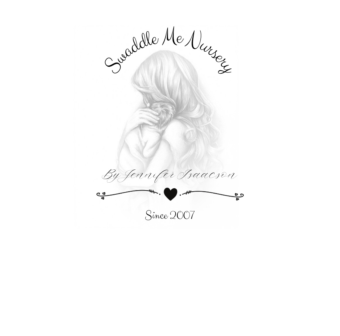
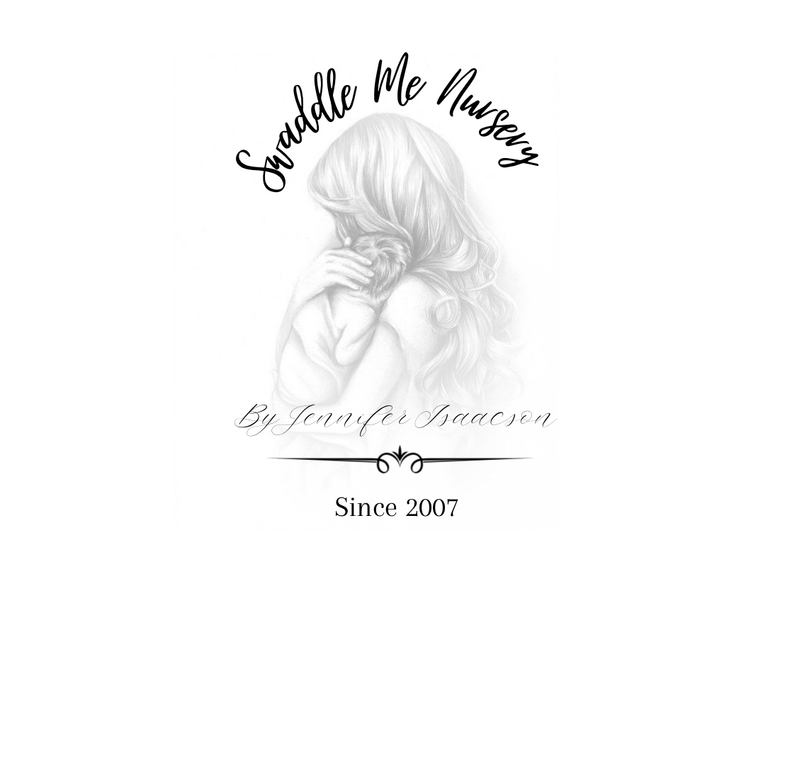

These is the main design we decided to go with, once you go down the rabbit hole of fonts… you may never return  these only have minor differences…
3 Likes
I like #1
2 Likes
I also like #1… But can’t really tell the difference between it and #3. 
1 Like
So subtle, I can’t tell the different between 1 and 3, what is it? I like them more than 2.
3 Likes
Oh good, I’m not the only one.
3 Likes
I’m waiting for her to come back and say oops I uploaded the same one twice so I don’t feel so crazy. 
3 Likes
Lmao 
2 Likes
Please don’t feel crazy! I was half asleep when I posted . I guess you guys worked your brains like in those find the differences pictures, lol. One and three are the same.
5 Likes
It’s like the game “find the differences” but with nothing to find
I prefer #1.
4 Likes
Yay! I thought I was just tired or possibly loosing my mind. I looked way longer than I care to admit. 

1 Like
I like the top font on 1 and the bottom font on 2
1 Like
Lololol!
Thank you all!! 
So you like the 2007 being in a less fancy font?
1 Like
Yes.
I feel like I am being really particular about something that isnt mine… LOL
If it were mine…
I would use the top font but the rest of #2. I like the whole bottom portion of that one better
1 Like
I like #3.
Lol! Don’t feel that way at all! I love hearing your feedback and opinions 
1 Like
Beautiful logo 
1 Like